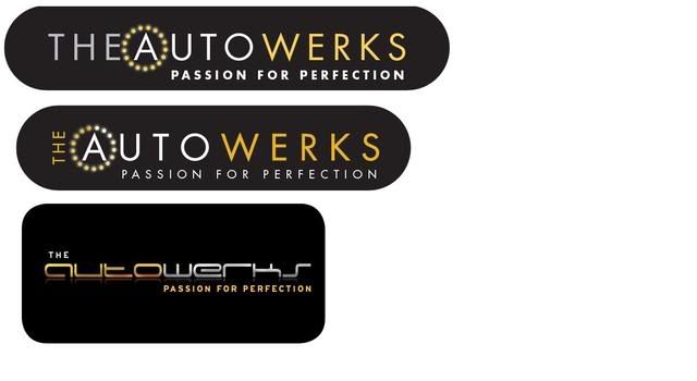
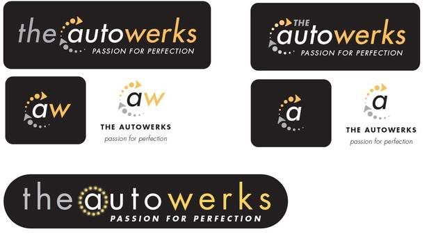
User Tag List

Thanks Thanks:  0
Likes Likes:  0
Page 1 of 5 123 ... LastLast
Results 1 to 10 of 42

Thread: Opinions required - company logo designs

  1. #1
    Regular Member Harry's Avatar
    Join Date
    Aug 2005
    Location
    Uxbridge, London
    Post Thanks / Like
    Mentioned
    1 Post(s)
    Tagged
    0 Thread(s)
    Vehicle InfoStats


    Default Opinions required - company logo designs

    Hi everyone,

    As some of you will know I'm starting up my own business. I've had a whole bunch of logo designs through from the company that is doing it and I'd like your opinions on some of them, I've only included a small selection as it would be baffling to inlcude them all.

    The services that we'll be offering are as follows:
    - alloy wheel refurbishment
    - window tinting
    - tyres
    - valeting
    - paint protection film
    - SMART repairs

    I've got my favourite of the ones below, but I'd like unbiased opinions so I won't tell you which I prefer.

    Please be brutally honest, and if you think something needs tweaking then just say and I'll try and get it done.

    Thanks in advance for all the feedback.


  2. #2
    Regular Member lofty's Avatar
    Join Date
    Sep 2007
    Location
    @home
    Post Thanks / Like
    Mentioned
    0 Post(s)
    Tagged
    0 Thread(s)
    Vehicle InfoStats

    Vehicle : Vectra C Estate

    Trim : Elite

    Engine : 1.9 CDTi


    Default

    top right looks pretty good.

  3. #3
    Regular Member Leviathan's Avatar
    Join Date
    Feb 2008
    Location
    Middlesbrough, Cleveland
    Post Thanks / Like
    Mentioned
    0 Post(s)
    Tagged
    0 Thread(s)
    Vehicle InfoStats


    Default

    Personally for ease of reproduction on letter heads and use on other stationary the white background ones are better imo, scale down a little easier, are just as effective and tend to stay in fashion longer.

  4. #4
    Regular Member lofty's Avatar
    Join Date
    Sep 2007
    Location
    @home
    Post Thanks / Like
    Mentioned
    0 Post(s)
    Tagged
    0 Thread(s)
    Vehicle InfoStats

    Vehicle : Vectra C Estate

    Trim : Elite

    Engine : 1.9 CDTi


    Default

    Quote Originally Posted by Leviathan View Post
    Personally for ease of reproduction on letter heads and use on other stationary the white background ones are better imo, scale down a little easier, are just as effective and tend to stay in fashion longer.
    very good point. Got a habit of only thinking about web designs these days..

    Maybe use two?

  5. #5
    Regular Member Harry's Avatar
    Join Date
    Aug 2005
    Location
    Uxbridge, London
    Post Thanks / Like
    Mentioned
    1 Post(s)
    Tagged
    0 Thread(s)
    Vehicle InfoStats


    Default

    Quote Originally Posted by Leviathan View Post
    Personally for ease of reproduction on letter heads and use on other stationary the white background ones are better imo, scale down a little easier, are just as effective and tend to stay in fashion longer.
    yep...good point. i assume you are referring to the shortened 'symbol' logos, which show the 'aw' or just the 'a' by itself.

    The scope of the design work was that i wanted the full logo i.e. the autowerks, but also wanted a smaller symbol, that would be recognisable without seeing the entire logo.

    I'll ask for them to flip a few of the black background ones to one and see how the 'auto' in black looks.

    cheers for the advice, it's exactly what i'm looking for.

  6. #6
    Regular Member RSV_Ecosse's Avatar
    Join Date
    Mar 2006
    Location
    Falkirk, Scotland
    Post Thanks / Like
    Mentioned
    0 Post(s)
    Tagged
    0 Thread(s)
    Vehicle InfoStats


    Default

    Top right gets my vote.

    I'm curious and this is probably very cheeky of me, but how much are they charging you for this m8?.

    Only asking as I run my own web design and development business ( part time when I'm not fighting fires....lol ) and I usually include a design of a logo for the companies that contact me looking to get a web presence up and running.

    PM me if you don't want to divulge any details here.

    And again, apologies for asking such a "forward" question of you.

  7. #7
    Regular Member Harry's Avatar
    Join Date
    Aug 2005
    Location
    Uxbridge, London
    Post Thanks / Like
    Mentioned
    1 Post(s)
    Tagged
    0 Thread(s)
    Vehicle InfoStats


    Default

    Quote Originally Posted by RSV_Ecosse View Post
    Top right gets my vote.

    I'm curious and this is probably very cheeky of me, but how much are they charging you for this m8?.

    Only asking as I run my own web design and development business ( part time when I'm not fighting fires....lol ) and I usually include a design of a logo for the companies that contact me looking to get a web presence up and running.

    PM me if you don't want to divulge any details here.

    And again, apologies for asking such a "forward" question of you.
    no worries....i don't mind people asking forward questions.

    i'll PM you with all the details

  8. #8
    Regular Member hans_vledder's Avatar
    Join Date
    Jan 2007
    Location
    't Veld - The Netherlands
    Post Thanks / Like
    Mentioned
    0 Post(s)
    Tagged
    0 Thread(s)
    Vehicle InfoStats


    Default

    Quote Originally Posted by Leviathan View Post
    Personally for ease of reproduction on letter heads and use on other stationary the white background ones are better imo, scale down a little easier, are just as effective and tend to stay in fashion longer.
    I agree with Leviathan. I love the more modern type face of the bottom one however ...

    Regards,
    Hans

  9. #9
    Regular Member Harry's Avatar
    Join Date
    Aug 2005
    Location
    Uxbridge, London
    Post Thanks / Like
    Mentioned
    1 Post(s)
    Tagged
    0 Thread(s)
    Vehicle InfoStats


    Default

    Quote Originally Posted by hans_vledder View Post
    I agree with Leviathan. I love the more modern type face of the bottom one however ...

    Regards,
    Hans
    my only concern with that one is that the text is harder to read than the others, and whether it will go out of fashion - although i've been told that it's similar to the porsche font, and that hasn't been a bad thing for them

  10. #10
    Ex-Staff Full Member Ian T's Avatar
    Join Date
    Jan 2006
    Location
    Skynet HQ EMEC#5
    Post Thanks / Like
    Mentioned
    0 Post(s)
    Tagged
    0 Thread(s)
    Vehicle InfoStats


    Default

    I would say top right or the bottom one Harry.

    Hope everything is going to plan for you Harry

Page 1 of 5 123 ... LastLast

Thread Information

Users Browsing this Thread

There are currently 1 users browsing this thread. (0 members and 1 guests)

Similar Threads

  1. Company logo design... HELP NEEDED!!
    By simmo3187 in forum General Chat
    Replies: 12
    Last Post: 19th March 2012, 12:00
  2. Help me out,opinions required
    By VECTRA HEAD in forum General Motoring Chat
    Replies: 25
    Last Post: 9th February 2012, 23:07
  3. Insurance Company Help Required
    By Leviathan in forum Insurance Chat
    Replies: 14
    Last Post: 22nd May 2008, 13:39
  4. Opinions Required
    By VauxVeteran in forum Vectra C / Signum Car Chat
    Replies: 9
    Last Post: 6th March 2008, 00:57
  5. Opinions Required
    By thegoldenbullet in forum Vectra C / Signum Car Chat
    Replies: 22
    Last Post: 15th August 2007, 07:30

Visitors found this page by searching for:

Nobody landed on this page from a search engine, yet!

Bookmarks

Posting Permissions

  • You may not post new threads
  • You may not post replies
  • You may not post attachments
  • You may not edit your posts
  •